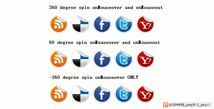
一款纯css3实现的圆形旋转分享按钮。旋转的角度可以自己调整。在demo中演示了三个角度旋转。360度,60度,-360度,喜欢的朋友可以参考下
源码下载
看下实现代码:
html代码:
复制代码
代码如下:<b>360 degree spin onMouseover and onMouseout</b></p>
<p id="socialicons">
<a href="http://www.w2bc.com/">
<img border="0" src="rss.png" /></a> <a href="http://www.w2bc.com/">
<img border="0" src="delicious.png" /></a> <a href="http://www.w2bc.com/">
<img border="0" src="facebook.png" /></a> <a href="http://www.w2bc.com/">
<img border="0" src="twitter.png" /></a> <a href="http://www.w2bc.com/">
<img border="0" src="yahoo.png" /></a>
</p>
<p>
<b>60 degree spin onMouseover and onMouseout</b></p>
<p id="socialicons2">
<a href="http://www.w2bc.com/">
<img border="0" src="rss.png" /></a> <a href="http://www.w2bc.com/">
<img border="0" src="delicious.png" /></a> <a href="http://www.w2bc.com/">
<img border="0" src="facebook.png" /></a> <a href="http://www.w2bc.com/">
<img border="0" src="twitter.png" /></a> <a href="http://www.w2bc.com/">
<img border="0" src="yahoo.png" /></a>
</p>
<p>
<b>-360 degree spin onMouseover ONLY</b></p>
<p id="socialicons3">
<a href="http://www.w2bc.com/">
<img border="0" src="rss.png" /></a> <a href="http://www.w2bc.com/">
<img border="0" src="delicious.png" /></a> <a href="http://www.w2bc.com/">
<img border="0" src="facebook.png" /></a> <a href="http://www.w2bc.com/">
<img border="0" src="twitter.png" /></a> <a href="http://www.w2bc.com/">
<img border="0" src="yahoo.png" /></a>
</p>
css代码:
复制代码
代码如下:p#socialicons img
{
/* 1st set of icons. Rotate them 360deg onmouseover and out */
-moz-transition: all 0.8s ease-in-out;
-webkit-transition: all 0.8s ease-in-out;
-o-transition: all 0.8s ease-in-out;
-ms-transition: all 0.8s ease-in-out;
transition: all 0.8s ease-in-out;
}
p#socialicons img:hover
{
-moz-transform: rotate(360deg);
-webkit-transform: rotate(360deg);
-o-transform: rotate(360deg);
-ms-transform: rotate(360deg);
transform: rotate(360deg);
}
p#socialicons2 img
{
/* 2nd set of icons. Rotate them 60deg onmouseover and out */
-moz-transition: all 0.2s ease-in-out;
-webkit-transition: all 0.2s ease-in-out;
-o-transition: all 0.2s ease-in-out;
-ms-transition: all 0.2s ease-in-out;
transition: all 0.2s ease-in-out;
}
p#socialicons2 img:hover
{
-moz-transform: rotate(70deg);
-webkit-transform: rotate(70deg);
-o-transform: rotate(70deg);
-ms-transform: rotate(70deg);
transform: rotate(70deg);
}
p#socialicons3 img
{
/* 3rd set of icons. Rotate them -360deg onmouseover ONLY. Note where the "transition prop is added */
}
p#socialicons3 img:hover
{
-moz-transition: all 0.5s ease-in-out;
-webkit-transition: all 0.5s ease-in-out;
-o-transition: all 0.5s ease-in-out;
-ms-transition: all 0.5s ease-in-out;
transition: all 0.5s ease-in-out;
-moz-transform: rotate(-360deg);
-webkit-transform: rotate(-360deg);
-o-transform: rotate(-360deg);
-ms-transform: rotate(-360deg);
transform: rotate(-360deg);
}