来源:自学PHP网 时间:2015-04-14 14:51 作者: 阅读:次
[导读] 今天来看一个使用hover触发的一个手风琴效果,鼠标hover时改变图像宽度,配合transition实现动画,效果如下图所示。大家也可以到我的codepen在线编辑、下载收藏。感谢TheCodePlayer的图片和...
|
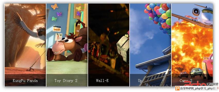
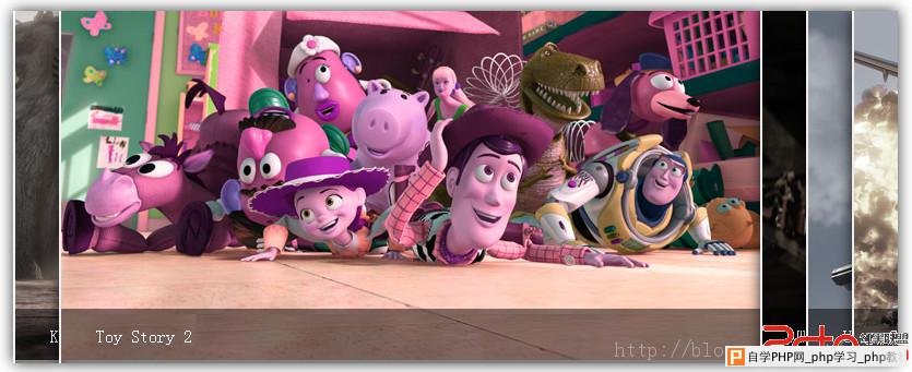
今天来看一个使用hover触发的一个手风琴效果,鼠标hover时改变图像宽度,配合transition实现动画,效果如下图所示。大家也可以到我的codepen在线编辑、下载收藏。 感谢TheCodePlayer的图片和灵感。
下面来看看html,我们用ul、li来布局案例,我们需要一个图像盒子和一个图像描述的盒子。 接下来,我们来看看CSS的写法,这里我们用到了normalize.css和prefix free。首先我们来进行布局 /* 让顶盒子居中显示 */
.accordian{
width:850px;
/* 850=(800+2)*5+20*2 */
margin:100px auto;
}
/* 配置li */
.accordian li{
list-style:none;
width:160px;
height: 320px;
float:left;
position:relative;
overflow:hidden;
border-left:2px solid rgba(255,255,255,.8);
}
/* 配置图像信息盒子 */
.accordian li .image_title{
position:absolute;
width:100%;
height:50px;
background-color:rgba(0,0,0,.5);
text-indent:2em;
line-height:50px;
bottom:0px;
left:0
}
/* 改变链接 */
.accordian a{
color:#fff;
text-decoration:none;
}然后我们来看关键,设置li的hover前后状态。我们需要改变的是li的宽度,hover之前都是160px,hover之后激活的li宽640px,其余的40px
/* hover之后所有的li宽改为40px */
.accordian ul:hover li{
  width:40px;
}
/* hover之后激活的li宽为640px,注意这两个设置有先后顺序 */
.accordian ul li:hover{
  width:640px;
}
同时,我们需要给li增加transition。
.accordian li{

 /* 之前的代码省略 */
 /* 新增transition属性 */
  transition:all 2s;
}
这样我们就完成了整个效果,为了优化效果,我们增加了hover前后的图像滤镜,不幸的是这个效果只有webkit内核认识,为了代码的未来兼容性我们还是增加了标准属性(虽说现在暂时没有用),代码如下。
.accordian ul:hover li{
  width:40px;
  -webkit-filter:grayscale(.8);
  filter:grayscale(.8);
}
.accordian ul li:hover{
  width:640px;
  -webkit-filter:grayscale(0) hue-rotate(300deg);
  filter:grayscale(0) hue-rotate(300deg);
}
好的,整个CSS文件如下。
.accordian{
  width:850px;
  margin:100px auto;
}
.accordian li{
  float:left;
  list-style:none;
  width:160px;
  height:320px;
  transition:all 2s;
  position:relative;
  overflow:hidden;
  border-left:2px solid rgba(255,255,255,.8);
  box-shadow:0px 0px 20px rgba(0,0,0,0.8);
}
.accordian ul:hover li{
  width:40px;
  -webkit-filter:grayscale(.8);
  filter:grayscale(.8);
}
.accordian ul li:hover{
  width:640px;
  -webkit-filter:grayscale(0) hue-rotate(300deg);
  filter:grayscale(0) hue-rotate(300deg);
}
.accordian li .image_title{
  position:absolute;
  width:100%;
  height:50px;
  background-color:rgba(0,0,0,.5);
  text-indent:2em;
  line-height:50px;
  bottom:0px;
  left:0
}
.accordian a{
  color:#fff;
  text-decoration:none;
}
考虑到案例的适用性,比如说以后照片可能会增加,使用LESS改变案例,CSS部分修正如下。 //图像个数
@imageN:5;
//图像hover之前的总宽度
@w:800px;
//图像hover之后的宽度
@imageL:640px;
//图像hover之前的宽度
@imageS:@w/@imageN;
//边框宽度
@bdWidth:2px;
//阴影宽度
@shadowWidth:20px;
.accordian{
width:@w + @bdWidth * @imageN + @shadowWidth*2;
margin:100px auto;
ul li{
float:left;
list-style:none;
width:@imageS;
transition:all 2s;
position:relative;
overflow:hidden;
border-left:1px solid rgba(255,255,255,.8);
border-left-width:@bdWidth;
box-shadow:0px 0px 20px rgba(0,0,0,0.8);
.image_title{
position:absolute;
width:100%;
height:50px;
background-color:rgba(0,0,0,.5);
text-indent:2em;
line-height:50px;
bottom:0px;
left:0
a{
color:#fff;
text-decoration:none;
}
}
}
ul:hover li{
width:@imageS - @imageL/@imageN;
-webkit-filter:grayscale(.8);
filter:grayscale(.8);
}
ul li:hover{
width:@imageL;
-webkit-filter:grayscale(0) hue-rotate(300deg);
filter:grayscale(0) hue-rotate(300deg);
}
}
---------------------------------------------------------------
前端开发whqet,关注web前端开发技术,分享网页相关资源。 |
自学PHP网专注网站建设学习,PHP程序学习,平面设计学习,以及操作系统学习
京ICP备14009008号-1@版权所有www.zixuephp.com
网站声明:本站所有视频,教程都由网友上传,站长收集和分享给大家学习使用,如由牵扯版权问题请联系站长邮箱904561283@qq.com