来源:自学PHP网 时间:2015-04-14 14:51 作者: 阅读:次
[导读] 今天来看一个纯CSS实现的图像3D效果,请大家先到我的codepen里看看效果,效果如下图所示。左边为起始状态,右边为悬停效果。实现原理如下图所示,用div img装载图像的上半段, img:f...
|
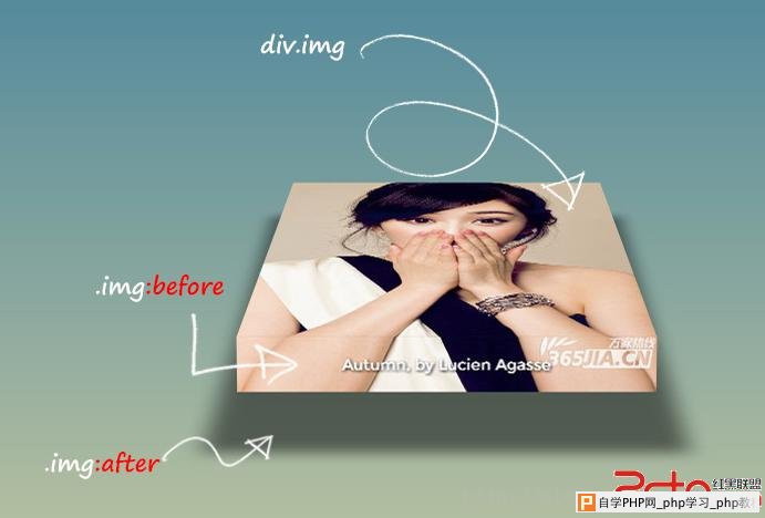
今天来看一个纯CSS实现的图像3D效果,请大家先到我的codepen里看看效果,效果如下图所示。
左边为起始状态,右边为悬停效果。实现原理如下图所示,用div.img装载图像的上半段,.img:fefore伪类来实现图像的下半段、呈现图像标题,用.img:after伪类实现图像的阴影。
好的,我们来看代码,首先是非常简单的HTML 其次是CSS,CSS代码非常关键,我们首先需要完成布局。 /*导入字体*/
@import url(http://fonts.googleapis.com/css?family=Montserrat);
/*背景弄个渐变*/
body {
min-height:600px;
background: linear-gradient( hsl(200,51%,40%), #E0D7A3);
}
/*为了实现整体动画效果,我们在图像外面放个容器,*/
.container{
width:300px;
height:380px;
margin:50px auto;
/*统一实现3D动画的深度*/
perspective: 1000px;
}
.img{
width:100%;
height:100%;
background: url("http://www.cmen.cc/uploadfile/2013/1212/20131212044827530.jpg");
background-size:100%;
position:relative;
}
.img:before{
content:attr(data-text);
width:100%;
height:40px;
position:absolute;
top:100%;
left:0;
background: url("http://www.cmen.cc/uploadfile/2013/1212/20131212044827530.jpg") left bottom;
background-size:100%;
/*设置图片标题字体样式*/
font-size: 1.6vw;
font-family: Montserrat, Arial, sans-serif;
color:#fff;
text-shadow:1px 1px 3px #000;
text-align:center;
line-height:40px;
/*图像下半部分折下去*/
transform-style: preserve-3d;
transform-origin: center top;
transition:all 1s transform;
transform:rotateX(-80deg);
}
.img:after {
content: '';
position: absolute; top: 0; left: 0;
width: 100%; height: 100%;
box-shadow: 0 0 100px 50px rgba(0, 0, 0, .2), inset 0 0 250px 250px rgba(0, 0, 0, .2);
/*阴影部分的动画参数*/
perspective: 1000px;
transform-style: preserve-3d;
transform-origin: center bottom;
transform: rotateX(90deg) translateZ(-80px) scale(0.75);
}
/*鼠标悬停之后的图像折上去*/
.container:hover .img{
transform: rotateX(75deg) translateZ(50px);
}
/*鼠标悬停之后阴影动画*/
.container:hover .img:after{
box-shadow: 0 0 25px 25px rgba(0, 0, 0, 0.5), inset 0 0 250px 250px rgba(0, 0, 0, 0.5);
transform: rotateX(-5deg) translateZ(-80px) scale(1);
}相信大家结合注释应该能看明白,不再具体具体解释代码书写过程,大家可以到codepen在线编辑或下载本效果。---------------------------------------------------------------
前端开发whqet,关注web前端开发技术,分享网页相关资源。 |
自学PHP网专注网站建设学习,PHP程序学习,平面设计学习,以及操作系统学习
京ICP备14009008号-1@版权所有www.zixuephp.com
网站声明:本站所有视频,教程都由网友上传,站长收集和分享给大家学习使用,如由牵扯版权问题请联系站长邮箱904561283@qq.com