来源:自学PHP网 时间:2015-04-14 14:50 作者: 阅读:次
[导读] 在线演示我们想要展示如何利用CSS3 clip属性制作一种简单而整洁的扩展效果,当点击一个box元素时实现平稳过渡。这个想法是为了实现某种叠加效果,好像它实际上在各个元素的下面。...
|
在线演示
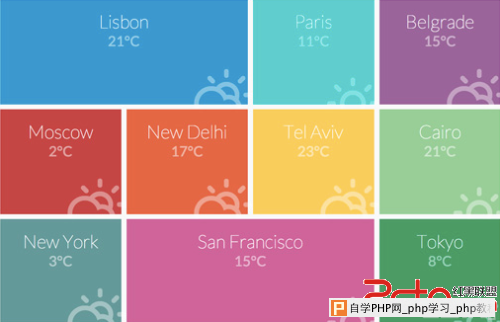
我们想要展示如何利用CSS3 clip属性制作一种简单而整洁的扩展效果,当点击一个box元素时实现平稳过渡。这个想法是为了实现某种叠加效果,好像它实际上在各个元素的下面。点击其中一个元素将创建一个切断图片的效果,展示将被宽展开的另一层。
更多相关前端技术内容,请关注极客标签
怎样做?
首先,我们要创建一个项目列表,它将看起来像是装满不同城市名称的盒子:
 每 一个箱子将包含一个元素(覆盖层),该元素的位置将被固定。实际上这个元素会铺满整个页面,但我们不会看到它,因为透明度opacity将被设置为0。当 我们点击一个盒子,我们将使用clip:rect()修剪各自的内部固定元素。然后我们将动态展示所有叠加的宽度和高度,做为整个视窗:
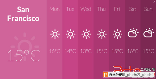 单击关闭按钮将反转这个效果,并且使列表项的大小最小化并消失。
那么,让我们从HTML开始吧!
标记:
我 们将为这些盒子使用一个无序列表。每个列表项将会有一个图标类和一个可选的“span”类,将控制盒子的宽度。在里面将添加一些文本和覆盖的层。叠加的部 分将包含一个列布局的结构。因为我们选择了一个虚拟的天气应用程序作为主题,所以我们将显示未来七天的天气预报。每个“day”列有一些span,用做工 作日、天气图标和温度:
<ul id="rb-grid" class="rb-grid clearfix">
<li class="icon-clima-1 rb-span-2">
<h3>Lisbon</h3>
<span class="rb-temp">21°C</span>
<div class="rb-overlay">
<span class="rb-close">close</span>
<div class="rb-week">
<div><span class="rb-city">Lisbon</span><span class="icon-clima-1"></span><span>21°C</span></div>
<div><span>Mon</span><spanclass="icon-clima-1"></span><span>19°C</span></div>
<div><span>Tue</span><spanclass="icon-clima-2"></span><span>19°C</span></div>
<div><span>Wed</span><spanclass="icon-clima-2"></span><span>18°C</span></div>
<div><span>Thu</span><spanclass="icon-clima-2"></span><span>17°C</span></div>
<div><span>Fri</span><spanclass="icon-clima-1"></span><span>19°C</span></div>
<div><span>Sat</span><spanclass="icon-clima-1"></span><span>22°C</span></div>
<div><span>Sun</span><spanclass="icon-clima-1"></span><span>18°C</span></div>
</div>
</div>
</li>
<li class="icon-clima-2">
<h3>Paris</h3><span class="rb-temp">11°C</span>
<div class="rb-overlay">
<!-- ... -->
</div>
</li>
<li><!-- ... --></li>
<!-- ... -->
</ul>
让我们看看CSS:
一个无序列表将会集中在父结点,我们将会去掉列表样式:
.rb-grid {
list-style: none;
text-align: center;
margin: 0 auto;
}
列表项将有一个不固定的宽度,我们将给他们一个15em的高度。它将浮在左边:
.rb-grid li {
width: 24%;
height: 15em;
margin: 0.5%;
background: #8CC7DF;
color: #fff;
display: block;
float: left;
padding: 1.6em;
cursor: pointer;
position: relative;
}
网格内的项目有三种不同的宽度,“默认”的那个是24%,下面的其他两个是:
.rb-grid li.rb-span-2 {
width: 49%;
}
.rb-grid li.rb-span-4 {
width: 99%;
}
让我们给城市标题加些料:
.rb-grid li h3 {
font-size: 2.6em;
font-weight: 100;
}
为 图标字体添加一个CSS文件。它是Climacons字体,由Adam Whitcroft 创建。你可以查看climacons.css看看我们包括了哪个图标。基本上,我们使用图标类来添加带伪元素的图标。在网格里,我们希望他们是被绝对定位 在右下角,有点像被剥夺了权利。
.rb-grid li[class^="icon-"]:before,
.rb-grid li[class*=" icon-"]:before {
font-size: 10em;
position: absolute;
display: block;
width: 100%;
height: 100%;
top: 0;
left: 0;
line-height: 3;
opacity: 0.4;
text-align: right;
pointer-events: none;
}
温度显示效果是半透明的,我们为它的opacity添加一个过渡:
.rb-temp {
display: block;
font-size: 2em;
opacity: 0.5;
transition: all 0.3s ease-in-out;
}
当悬浮在一个列表项上,我们简单增加:
.rb-grid li:hover .rb-temp {
opacity: 1;
}
现在,让我们看一看重要的重叠部分。最后的视图,我们是想要一个全屏范围的重叠效果,所以我们将把它的宽度和高度设置到100%。我 们不希望它是相对于任何东西,而是希望它在顶部,所以要给它固定了位置。因为这将让它出现在所有东西的顶部,会有重叠,很多重叠!这时需要在初始时设置 z-index为-1。这将把它们统统放在内容页面的后面。设置opacity为0会使他们不可见:
.rb-overlay {
opacity: 0;
position: fixed;
top: 0;
left: 0;
width: 100%;
height: 100%;
transition: all 0.4s ease;
z-index: -1;
pointer-events: none;
cursor: default;
}
这就是初始状态的叠加。一旦我们点击列表项,将为clip属性设置正确的rect()值,动态扩展。
让我们看看其余的样式。
每个叠加层有点接近“按钮”,将被定位在右上角:
.rb-close {
position: absolute;
top: 0.4em;
right: 0.4em;
width: 2em;
height: 2em;
text-indent: -9000px;
cursor: pointer;
z-index: 1000;
}
.rb-close:before {
content: 'x';
font-weight: 100;
position: absolute;
top: 0;
left: 0;
width: 100%;
height: 100%;
font-size: 3em;
line-height: 0.6;
text-align: center;
text-indent: 0px;
}
列的包装有rb-week类(虽然我们也包括当前天气列在内)。需要将它设置为100%的宽度和高度以便我们可以准确的定义它的孩子的高度和宽度:
.rb-week {
width: 100%;
height: 100%;
}
“列”会有一个10%的宽度(除了第一个有30%的宽度),他们将浮动在左边:
.rb-week > div {
width: 10%;
height: 100%;
float: left;
position: relative;
padding: 3% 0;
}
.rb-week > div:first-child {
width: 30%;
}
总共有八个列,10% 乘以7结果是70%,加上我们有30%的左边第一列。
每个span有一个30%的高度和间距:
.rb-week span {
padding: 5% 0;
font-size: 2em;
font-weight: 100;
display: block;
margin: auto 0;
height: 30%;
width: 100%;
line-height: 0.8;
}
城市名的span有一个特殊的风格,更小的字体权重:
.rb-week span.rb-city {
font-weight: 700;
padding: 1% 10%;
font-size: 1em;
line-height: 1.2;
}
图标将有一个增加的字体大小,我们需要重置字体权重,因为我们已经改变了它的规则:
.rb-week [class^="icon-"]:before {
font-size: 2.5em;
font-weight: normal;
}
图标在“当前天气列”几乎是透明的:
.rb-week > div:first-child [class^="icon-"] {
opacity: 0.1;
}
现在,让我们来为每个列表项定义不同的背景颜色。
我们有11个列表项:
/* Colors */
/* Grid */
.rb-grid li:nth-child(1) { background: #3399CC; }
.rb-grid li:nth-child(2) { background: #33CCCC; }
.rb-grid li:nth-child(3) { background: #996699; }
.rb-grid li:nth-child(4) { background: #C24747; }
.rb-grid li:nth-child(5) { background: #e2674a; }
.rb-grid li:nth-child(6) { background: #FFCC66; }
.rb-grid li:nth-child(7) { background: #99CC99; }
.rb-grid li:nth-child(8) { background: #669999; }
.rb-grid li:nth-child(9) { background: #CC6699; }
.rb-grid li:nth-child(10) { background: #339966; }
.rb-grid li:nth-child(11) { background: #666699; }
每个覆盖层我们有八个列:
/* Overlay Columns */
.rb-grid li:nth-child(1) .rb-week > div:nth-child(1) { background: #3399CC; }
.rb-grid li:nth-child(1) .rb-week > div:nth-child(2) { background: #2D87B4; }
.rb-grid li:nth-child(1) .rb-week > div:nth-child(3) { background: #297AA3; }
.rb-grid li:nth-child(1) .rb-week > div:nth-child(4) { background: #256E93; }
.rb-grid li:nth-child(1) .rb-week > div:nth-child(5) { background: #216283; }
.rb-grid li:nth-child(1) .rb-week > div:nth-child(6) { background: #1D5672; }
.rb-grid li:nth-child(1) .rb-week > div:nth-child(7) { background: #184962; }
.rb-grid li:nth-child(1) .rb-week > div:nth-child(8) { background: #143D52; }
.rb-grid li:nth-child(2) .rb-week > div:nth-child(1) { background: #33CCCC; }
.rb-grid li:nth-child(2) .rb-week > div:nth-child(2) { background: #2DB4B4; }
.rb-grid li:nth-child(2) .rb-week > div:nth-child(3) { background: #29A3A3; }
.rb-grid li:nth-child(2) .rb-week > div:nth-child(4) { background: #259393; }
.rb-grid li:nth-child(2) .rb-week > div:nth-child(5) { background: #218383; }
.rb-grid li:nth-child(2) .rb-week > div:nth-child(6) { background: #1D7272; }
.rb-grid li:nth-child(2) .rb-week > div:nth-child(7) { background: #186262; }
.rb-grid li:nth-child(2) .rb-week > div:nth-child(8) { background: #145252; }
最后但并非最不重要,让我们用小屏幕来检验。当空间有限,我们就不希望在网格中显示盒子了:
@media screen and (max-width: 63.125em) {
.rb-grid li,
.rb-grid li.rb-span-2,
.rb-grid li.rb-span-4 {
width: 100%;
height: 10em;
text-align: left;
}
.rb-grid li[class^="icon-"]:before,
.rb-grid li[class*=" icon-"]:before {
font-size: 6em;
left: auto;
right: 0;
line-height: 2.5;
}
.rb-grid li > div {
text-align: center;
}
}
JAVASCRIPT:
var $items = $( '#rb-grid > li' ),
transEndEventNames = {
'WebkitTransition' : 'webkitTransitionEnd',
'MozTransition' : 'transitionend',
'OTransition' : 'oTransitionEnd',
'msTransition' : 'MSTransitionEnd',
'transition' : 'transitionend'
},
// transition end event name
transEndEventName = transEndEventNames[ Modernizr.prefixed( 'transition' ) ],
// window and body elements
$window = $( window ),
$body = $( 'BODY' ),
// transitions support
supportTransitions = Modernizr.csstransitions,
// current item's index
current = -1,
// window width and height
winsize = getWindowSize();
当点击每个条目时,如果不支持过渡效果,就会跳过第一个状态并且叠加效果会立即扩展。
initEvents() {
$items.each( function() {
var $item = $( this ),
$close = $item.find( 'span.rb-close' ),
$overlay = $item.children( 'div.rb-overlay' );
$item.on( 'click', function() {
if( $item.data( 'isExpanded' ) ) {
return false;
}
$item.data( 'isExpanded', true );
// save current index of the item
current = $item.index();
var layoutProp = getItemLayoutProp( $item ),
clipPropFirst = 'rect(' + layoutProp.top + 'px ' + ( layoutProp.left + layoutProp.width ) + 'px ' + ( layoutProp.top + layoutProp.height ) + 'px ' + layoutProp.left + 'px)',
clipPropLast = 'rect(0px ' + winsize.width + 'px ' + winsize.height + 'px 0px)';
$overlay.css( {
clip : supportTransitions ? clipPropFirst : clipPropLast,
opacity : 1,
zIndex: 9999,
pointerEvents : 'auto'
} );
if( supportTransitions ) {
$overlay.on( transEndEventName, function() {
$overlay.off( transEndEventName );
setTimeout( function() {
$overlay.css( 'clip', clipPropLast ).on( transEndEventName, function() {
$overlay.off( transEndEventName );
$body.css( 'overflow-y', 'hidden' );
} );
}, 25 );
} );
}
else {
$body.css( 'overflow-y', 'hidden' );
}
} );
...
} );
...
}
function getItemLayoutProp( $item ) {
var scrollT = $window.scrollTop(),
scrollL = $window.scrollLeft(),
itemOffset = $item.offset();
return {
left : itemOffset.left - scrollL,
top : itemOffset.top - scrollT,
width : $item.outerWidth(),
height : $item.outerHeight()
};
}
|
自学PHP网专注网站建设学习,PHP程序学习,平面设计学习,以及操作系统学习
京ICP备14009008号-1@版权所有www.zixuephp.com
网站声明:本站所有视频,教程都由网友上传,站长收集和分享给大家学习使用,如由牵扯版权问题请联系站长邮箱904561283@qq.com