来源:自学PHP网 时间:2015-01-08 09:51 作者: 阅读:次
[导读] ...
|
由于用户浏览器分辨率分布、运营维护成本、全站页面宽度规范等原因,2012年末一淘新首页对1200px、990px、750px(for ipad)这3个尺寸的响应不同布局,期望在ipad下横屏显示990px版本,竖版显示750版本,iphone下显示750版本。不同设备尺寸的不同 显示自然少不了viewport设置,目前W3C针对viewport的规范还处于草案阶段,有2种方式可以设置页面的 viewport,viewport meta标签和@viewport css方式。 一、viewport meta element
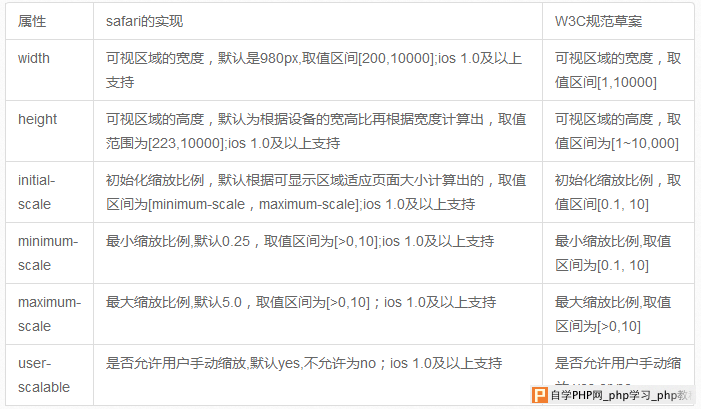
该viewport meta支持以下6个属性,ios对viewport meta的实现对比W3C规范草案:
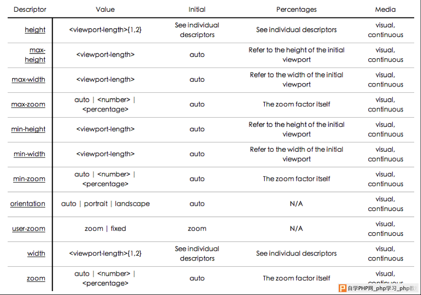
二、@viewport css 如: @viewport { width: device-width; zoom: 2.0; } w3c草案中@viewport 支持以下属性
viewport meta方式和@viewport是可以相互转化的,估计以后@viewport是要替代viewport meta的。如:
而且@viewport可以和media query联用,天造地设的一双呀,这样可以针对不同的终端尺寸设置不同的viewport。
不过,@viewport目前safari并不支持,Opera Mobile 11、ie10支持@viewport,但需要加私有前缀(-o-viewport、-ms-viewport),其他浏览器均不支持
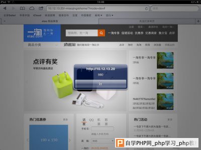
ipad横版990px
ipad竖版750px
ipad横版
ipad竖版
iphone竖版
结果发现左右2边都有大片的空白,原因是safari默认viewport的width是980px,js检测当前viewport确实是 980px,1200、990、750待响应的三个尺寸在980的容器中,所以显示出是750px的设计在980px的容器中居中的效果。 这不是想要的效果,众所周知,ipad的分辨率是1024×768,所以其横版能显示990的设计效果,竖版显示750的设计效果,既然viewport 的默认宽度是980,那就试试改变viewport的width。 ipad横版
ipad竖版
iphone竖版
viewport设置成width=device-width后,不管横版还是竖版viewport都是768px;理论上横版的最大分辨率为 1024,并没有显示990px的效果。测试发现,device-height为1024px,device-width的宽度并不会随着ipad横向还 是竖向而改变,想要横版viewport设置为device-height,竖版时设置为device-width,可以设置initial- scale,.
初始化不允许缩放设置后,并设置最大最小缩放比例,如果不设置,会导致横版切换到竖版时,页面出现横向滚动条,因为被放大了,设置最大缩放比例后ipad下能达到预期中的效果: ipad横版 ipad横版
ipad竖版
不过iphone下的就只能看到页面左上角一小部分了,如何解决呢,继续下面的问题 iphone
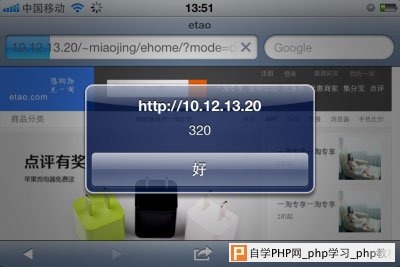
<meta name=“viewport” content=“initial-scale=1, maximum-scale=2, minimum-scale=1” /> 上面的设置ipad上显示正常,因为initial-scale=1初始化的缩放比例是1,而iphone的此时的viewport width是320,所以只能显示页面左上角320×480的区域。 要实现iphone下面,全屏显示750的效果,根据上面的测试,设置<meta name=“viewport” content=“width=device-width” />即可 如何实现不同设备不同viewport设置呢? 方法1:服务端加个user agent的判断,如果是ipad就显示上面特殊的meta设置。 但是服务端判断user agent也有个缺点,不方便枚举出所有平板电脑的user agent,平板电脑日新月异,维护这么多user agent也是个头疼的事情,不过有个开源的机型库wurfl,目前一淘无线的项目中也使用这个库。 方法2:js判断user agent,切换meta,这个不如服务端判断好。 方法3:css @viewport,这是@viewport的天职;可惜safari还不支持。 针对一淘首页这种情况,应该针对小于750px的设备特殊设置@viewport即可
@viewport safari不支持,最后只能使用方法1在服务端判断设置不同的viewport meta。 iphone下设置<meta name=“viewport” content=“width=device-width” />是期望中的效果
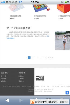
但是拖动到下面发现页尾背景显示不全
页尾的实现大致如下:
原因是没有给etao-footer定宽,对于根元素下面的containing block其宽度由viewport的尺寸决定。 iphone下viewport为320,所以看到的效果是background-color只平铺了320px的宽度,解决方法可以针对容器添加个 min-width:750px;所以viewport的设置可能会影响页面根元素的宽度,需要注意下。 结束语 设备适配设置meta viewport相关属性即可,不同设备适配需要服务端判断user agent,更好的设置方式是@viewport,但是safari不支持,所以目前还是meta viewport方式靠谱,设置viewport后可能对页面根元素宽度有影响。 |
自学PHP网专注网站建设学习,PHP程序学习,平面设计学习,以及操作系统学习
京ICP备14009008号-1@版权所有www.zixuephp.com
网站声明:本站所有视频,教程都由网友上传,站长收集和分享给大家学习使用,如由牵扯版权问题请联系站长邮箱904561283@qq.com