来源:自学PHP网 时间:2015-04-14 14:50 作者: 阅读:次
[导读] 1.背景图片实现Html代码: a { display: block; float:left; margin-left:5px; height: 37px;line-height: 37px; background: url(btn_bg.png) no-repeat 0px 0px; color: #d84700; text-decora......
|
1.背景图片实现
Html代码:
a { display: block; float:left; margin-left:5px; height: 37px;line-height: 37px; background: url(btn_bg.png) no-repeat 0px 0px; color: #d84700; text-decoration: none; padding-left:18px; }
a span { display:block; background: url(btn_bg.png) no-repeat right 0px; padding-right:20px;}
a:hover { background: url(btn_bg.png) no-repeat 0px -37px;}
a:hover span{ background: url(btn_bg.png) no-repeat right -37px;}
Html代码:
<p>
<a href="#"><span>免费注册</span></a>
<a href="#"><span>登录</span></a>
<a href="#"><span>自适应宽度</span></a>
</p>
 原理就是做一个足够宽的背景,a和span都用同一张背景图,文字左侧部分显示的是a的背景,文字本身和右侧部分显示的是span的背景,拼接成一个按钮。
2.CSS3 火狐和Chrome实现
Html代码:
.button1{
-moz-border-radius:5px;
-webkit-border-radius:5px;
border-radius:5px;
-moz-box-shadow:0 1px 0 rgba(0,0,0,0.3);
-webkit-box-shadow:0 1px 0 rgba(0,0,0,0.3);
box-shadow:0 1px 0 rgba(0,0,0,0.3);
background: -moz-linear-gradient(19% 75% 90deg, #E0E0E0, #FAFAFA);
background: -webkit-gradient(linear, left top, left bottom, from(#FAFAFA), to(#E0E0E0));
color:#4A4A4A;
float:left;
font-family:arial,helvetica,sans-serif;
font-size:17px;
font-weight:bold;
padding:10px 15px;
text-shadow:1px 1px 0 rgba(255, 255, 255, 0.7);
}
.button1:hover{
background: -moz-linear-gradient(19% 75% 90deg,#D6D6D6, #FAFAFA);
background: -webkit-gradient(linear, left top, left bottom, from(#FAFAFA), to(#D6D6D6));
}
Html代码 :
<p><a class="button1">渐变圆角按钮</a></p><br />
效果:
 Html代码 :
.button7{
-moz-border-radius:3px;
-webkit-border-radius:3px;
border-radius:3px;
background: -moz-linear-gradient(19% 75% 90deg,#F0DEB8, #FDF0D1, #fff 100%);
background: -webkit-gradient(linear, 0% 0%, 0% 100%, from(#FFFFFF), to(#F0DEB8), color-stop(.3,#FDF0D1));
color:#836d4d;
float:left;
font-family:arial,helvetica,sans-serif;
font-size:15px;
font-weight:bold;
padding:6px 70px;
border: 1px solid #d4c198;
}
.button7:hover{
background: -moz-linear-gradient(19% 75% 90deg,#EBD9B4, #F2E6C8, #F5F5F5 100%);
background: -webkit-gradient(linear, 0% 0%, 0% 100%, from(#F5F5F5), to(#EBD9B4), color-stop(.3,#F2E6C8));
}
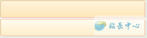
<a class="button7">站长网</a>
 |
自学PHP网专注网站建设学习,PHP程序学习,平面设计学习,以及操作系统学习
京ICP备14009008号-1@版权所有www.zixuephp.com
网站声明:本站所有视频,教程都由网友上传,站长收集和分享给大家学习使用,如由牵扯版权问题请联系站长邮箱904561283@qq.com