脚本之家介绍了很多款由纯css3实现的特效。鼠标啊,背景等等,今天要再给大家带来一款纯css3实现的超炫动画背画特效。代码非常简单,纯粹的css就可以完成,当然css代码也不多。效果非常炫
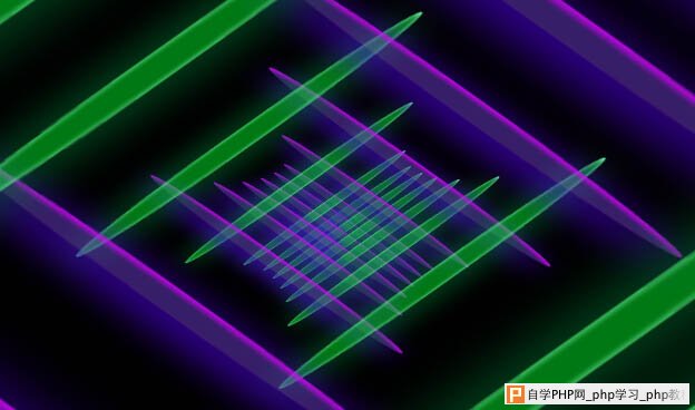
之前为大家介绍了很多款由纯css3实现的特效。今天要再给大家带来一款纯css3实现的超炫动画背画特效。代码非常简单,没有引用任何其它js代码。css代码也不多。效果非常炫。一起看下效果图:
实现的代码:
html代码:
复制代码
代码如下:<div class='fake-gif'>
<span class='stripe'></span><span class='stripe'></span><span class='stripe'></span>
<span class='stripe'></span><span class='stripe'></span><span class='stripe'></span>
<span class='stripe'></span><span class='stripe'></span><span class='stripe'></span>
<span class='stripe'></span><span class='stripe'></span><span class='stripe'></span>
<span class='stripe'></span><span class='stripe'></span><span class='stripe'></span>
<span class='stripe'></span><span class='stripe'></span><span class='stripe'></span>
<span class='stripe'></span><span class='stripe'></span><span class='stripe'></span>
<span class='stripe'></span><span class='stripe'></span><span class='stripe'></span>
<span class='stripe'></span><span class='stripe'></span>
</div>
<span class='stripe'></span><span class='stripe'></span><span class='stripe'></span>
<span class='stripe'></span><span class='stripe'></span><span class='stripe'></span>
<span class='stripe'></span><span class='stripe'></span><span class='stripe'></span>
<span class='stripe'></span><span class='stripe'></span><span class='stripe'></span>
<span class='stripe'></span><span class='stripe'></span><span class='stripe'></span>
<span class='stripe'></span><span class='stripe'></span><span class='stripe'></span>
<span class='stripe'></span><span class='stripe'></span><span class='stripe'></span>
<span class='stripe'></span><span class='stripe'></span><span class='stripe'></span>
<span class='stripe'></span><span class='stripe'></span>
</div>
css3代码:
复制代码
代码如下:body{
background: #000;
-webkit-perspective:35px;
-moz-perspective:35px;
-ms-perspective:35px;
-o-perspective:35px;
perspective:35px;
-webkit-transform-style:preserve-3d;
-moz-transform-style:preserve-3d;
-ms-transform-style:preserve-3d;
-o-transform-style:preserve-3d;
transform-style:preserve-3d;
-webkit-transform: rotateX(45deg) rotateY(0deg) rotateZ(45deg);
-moz-transform:rotateX(45deg) rotateY(0deg) rotateZ(45deg);
-ms-transform:rotateX(45deg) rotateY(0deg) rotateZ(45deg);
-o-transform:rotateX(45deg) rotateY(0deg) rotateZ(45deg);
transform:rotateX(45deg) rotateY(0deg) rotateZ(45deg);
}
.fake-gif {
position: relative;
margin: 10rem auto 0 auto;
width: 20rem;
height: 20rem;</p> <p>
}
.fake-gif .stripe {
position: absolute;
border-radius: 50%;
-webkit-box-shadow: 2px 2px 0 rgba(0, 0, 0, 0.3);
box-shadow: 2px 2px 0 rgba(0, 0, 0, 0.3);
-webkit-transform: translate3d(0px, 0px, 0px);
transform: translate3d(0px, 0px, 0px);
}
.fake-gif .stripe:nth-child(odd) {
left: 0;
width: 100%;
height: 5%;
background-color: rgba(109, 60, 209, 0.5);
box-shadow: 0px 6px 40px #5800FF, inset 0px 2px 5px #DF00FF;</p> <p>}
.fake-gif .stripe:nth-child(even) {
top: 0;
width: 5%;
height: 100%;
background-color: rgba(0, 240, 40, 0.5);
box-shadow: 0px 6px 40px #007D35, inset 0px 2px 5px #7CFFB5;
}
.fake-gif .stripe:nth-child(4n+1) {
z-index: 3;
}
.fake-gif .stripe:nth-child(4n+2) {
z-index: 4;
}
.fake-gif .stripe:nth-child(4n+3) {
z-index: 1;
}
.fake-gif .stripe:nth-child(4n) {
z-index: 2;
}
.fake-gif .stripe:nth-child(2) {
left: 4.7%;
-webkit-animation: move-y 2.7s 0.2s infinite;
animation: move-y 2.7s 0.2s infinite;
}
.fake-gif .stripe:nth-child(4) {
left: 11.9%;
-webkit-animation: move-y 2.7s 0.4s infinite;
animation: move-y 2.7s 0.4s infinite;
}
.fake-gif .stripe:nth-child(6) {
left: 19.1%;
-webkit-animation: move-y 2.7s 0.6s infinite;
animation: move-y 2.7s 0.6s infinite;
}
.fake-gif .stripe:nth-child(8) {
left: 26.3%;
-webkit-animation: move-y 2.7s 0.8s infinite;
animation: move-y 2.7s 0.8s infinite;
}
.fake-gif .stripe:nth-child(10) {
left: 33.5%;
-webkit-animation: move-y 2.7s 1s infinite;
animation: move-y 2.7s 1s infinite;
}
.fake-gif .stripe:nth-child(12) {
left: 40.7%;
-webkit-animation: move-y 2.7s 1.2s infinite;
animation: move-y 2.7s 1.2s infinite;
}
.fake-gif .stripe:nth-child(14) {
left: 47.9%;
-webkit-animation: move-y 2.7s 1.4s infinite;
animation: move-y 2.7s 1.4s infinite;
}
.fake-gif .stripe:nth-child(16) {
left: 55.1%;
-webkit-animation: move-y 2.7s 1.6s infinite;
animation: move-y 2.7s 1.6s infinite;
}
.fake-gif .stripe:nth-child(18) {
left: 62.3%;
-webkit-animation: move-y 2.7s 1.8s infinite;
animation: move-y 2.7s 1.8s infinite;
}
.fake-gif .stripe:nth-child(20) {
left: 69.5%;
-webkit-animation: move-y 2.7s 2s infinite;
animation: move-y 2.7s 2s infinite;
}
.fake-gif .stripe:nth-child(22) {
left: 76.7%;
-webkit-animation: move-y 2.7s 2.2s infinite;
animation: move-y 2.7s 2.2s infinite;
}
.fake-gif .stripe:nth-child(24) {
left: 83.9%;
-webkit-animation: move-y 2.7s 2.4s infinite;
animation: move-y 2.7s 2.4s infinite;
}
.fake-gif .stripe:nth-child(26) {
left: 91.1%;
-webkit-animation: move-y 2.7s 2.6s infinite;
animation: move-y 2.7s 2.6s infinite;
}
.fake-gif .stripe:nth-child(1) {
top: 3.6%;
-webkit-animation: move-x 2.7s 0.1s infinite;
animation: move-x 2.7s 0.1s infinite;
}
.fake-gif .stripe:nth-child(3) {
top: 10.8%;
-webkit-animation: move-x 2.7s 0.3s infinite;
animation: move-x 2.7s 0.3s infinite;
}
.fake-gif .stripe:nth-child(5) {
top: 18%;
-webkit-animation: move-x 2.7s 0.5s infinite;
animation: move-x 2.7s 0.5s infinite;
}
.fake-gif .stripe:nth-child(7) {
top: 25.2%;
-webkit-animation: move-x 2.7s 0.7s infinite;
animation: move-x 2.7s 0.7s infinite;
}
.fake-gif .stripe:nth-child(9) {
top: 32.4%;
-webkit-animation: move-x 2.7s 0.9s infinite;
animation: move-x 2.7s 0.9s infinite;
}
.fake-gif .stripe:nth-child(11) {
top: 39.6%;
-webkit-animation: move-x 2.7s 1.1s infinite;
animation: move-x 2.7s 1.1s infinite;
}
.fake-gif .stripe:nth-child(13) {
top: 46.8%;
-webkit-animation: move-x 2.7s 1.3s infinite;
animation: move-x 2.7s 1.3s infinite;
}
.fake-gif .stripe:nth-child(15) {
top: 54%;
-webkit-animation: move-x 2.7s 1.5s infinite;
animation: move-x 2.7s 1.5s infinite;
}
.fake-gif .stripe:nth-child(17) {
top: 61.2%;
-webkit-animation: move-x 2.7s 1.7s infinite;
animation: move-x 2.7s 1.7s infinite;
}
.fake-gif .stripe:nth-child(19) {
top: 68.4%;
-webkit-animation: move-x 2.7s 1.9s infinite;
animation: move-x 2.7s 1.9s infinite;
}
.fake-gif .stripe:nth-child(21) {
top: 75.6%;
-webkit-animation: move-x 2.7s 2.1s infinite;
animation: move-x 2.7s 2.1s infinite;
}
.fake-gif .stripe:nth-child(23) {
top: 82.8%;
-webkit-animation: move-x 2.7s 2.3s infinite;
animation: move-x 2.7s 2.3s infinite;
}
.fake-gif .stripe:nth-child(25) {
top: 90%;
-webkit-animation: move-x 2.7s 2.5s infinite;
animation: move-x 2.7s 2.5s infinite;
}</p> <p>@-webkit-keyframes move-y {
0%, 100% {
-webkit-transform: translateZ(-25px);
transform: translateZ(-25px);
}</p> <p> 50% {
-webkit-transform: translateZ(25px);
transform: translateZ(25px);
}
}</p> <p>@-webkit-keyframes move {
0%, 100% {
-webkit-transform: rotateX(-25deg) rotateY(-25deg);
transform: rotateX(-25deg) rotateY(-25deg);
}</p> <p> 50% {
-webkit-transform: rotateX(25px) rotateY(25deg);
transform: rotateX(25px) rotateY(25deg);
}
}</p> <p>@keyframes move-y {
0%, 100% {
-webkit-transform: translateY(-25%);
transform: translateY(-25%);
}</p> <p> 50% {
-webkit-transform: translateY(25%);
transform: translateY(25%);
}
}
@-webkit-keyframes move-x {
0%, 100% {
-webkit-transform: translateZ(-25px);
transform: translateZ(-25px);
}</p> <p> 50% {
-webkit-transform: translateZ(25px);
transform: translateZ(25px);
}
}
@keyframes move-x {
0%, 100% {
-webkit-transform: translateX(-25%);
transform: translateX(-25%);
}</p> <p> 50% {
-webkit-transform: translateX(25%);
transform: translateX(25%);
}
}
以上就是纯css3实现的超炫动画背画特效,是不是很简单,谢谢阅读,希望能帮到大家,请继续关注脚本之家,我们会努力分享更多优秀的文章。
background: #000;
-webkit-perspective:35px;
-moz-perspective:35px;
-ms-perspective:35px;
-o-perspective:35px;
perspective:35px;
-webkit-transform-style:preserve-3d;
-moz-transform-style:preserve-3d;
-ms-transform-style:preserve-3d;
-o-transform-style:preserve-3d;
transform-style:preserve-3d;
-webkit-transform: rotateX(45deg) rotateY(0deg) rotateZ(45deg);
-moz-transform:rotateX(45deg) rotateY(0deg) rotateZ(45deg);
-ms-transform:rotateX(45deg) rotateY(0deg) rotateZ(45deg);
-o-transform:rotateX(45deg) rotateY(0deg) rotateZ(45deg);
transform:rotateX(45deg) rotateY(0deg) rotateZ(45deg);
}
.fake-gif {
position: relative;
margin: 10rem auto 0 auto;
width: 20rem;
height: 20rem;</p> <p>
}
.fake-gif .stripe {
position: absolute;
border-radius: 50%;
-webkit-box-shadow: 2px 2px 0 rgba(0, 0, 0, 0.3);
box-shadow: 2px 2px 0 rgba(0, 0, 0, 0.3);
-webkit-transform: translate3d(0px, 0px, 0px);
transform: translate3d(0px, 0px, 0px);
}
.fake-gif .stripe:nth-child(odd) {
left: 0;
width: 100%;
height: 5%;
background-color: rgba(109, 60, 209, 0.5);
box-shadow: 0px 6px 40px #5800FF, inset 0px 2px 5px #DF00FF;</p> <p>}
.fake-gif .stripe:nth-child(even) {
top: 0;
width: 5%;
height: 100%;
background-color: rgba(0, 240, 40, 0.5);
box-shadow: 0px 6px 40px #007D35, inset 0px 2px 5px #7CFFB5;
}
.fake-gif .stripe:nth-child(4n+1) {
z-index: 3;
}
.fake-gif .stripe:nth-child(4n+2) {
z-index: 4;
}
.fake-gif .stripe:nth-child(4n+3) {
z-index: 1;
}
.fake-gif .stripe:nth-child(4n) {
z-index: 2;
}
.fake-gif .stripe:nth-child(2) {
left: 4.7%;
-webkit-animation: move-y 2.7s 0.2s infinite;
animation: move-y 2.7s 0.2s infinite;
}
.fake-gif .stripe:nth-child(4) {
left: 11.9%;
-webkit-animation: move-y 2.7s 0.4s infinite;
animation: move-y 2.7s 0.4s infinite;
}
.fake-gif .stripe:nth-child(6) {
left: 19.1%;
-webkit-animation: move-y 2.7s 0.6s infinite;
animation: move-y 2.7s 0.6s infinite;
}
.fake-gif .stripe:nth-child(8) {
left: 26.3%;
-webkit-animation: move-y 2.7s 0.8s infinite;
animation: move-y 2.7s 0.8s infinite;
}
.fake-gif .stripe:nth-child(10) {
left: 33.5%;
-webkit-animation: move-y 2.7s 1s infinite;
animation: move-y 2.7s 1s infinite;
}
.fake-gif .stripe:nth-child(12) {
left: 40.7%;
-webkit-animation: move-y 2.7s 1.2s infinite;
animation: move-y 2.7s 1.2s infinite;
}
.fake-gif .stripe:nth-child(14) {
left: 47.9%;
-webkit-animation: move-y 2.7s 1.4s infinite;
animation: move-y 2.7s 1.4s infinite;
}
.fake-gif .stripe:nth-child(16) {
left: 55.1%;
-webkit-animation: move-y 2.7s 1.6s infinite;
animation: move-y 2.7s 1.6s infinite;
}
.fake-gif .stripe:nth-child(18) {
left: 62.3%;
-webkit-animation: move-y 2.7s 1.8s infinite;
animation: move-y 2.7s 1.8s infinite;
}
.fake-gif .stripe:nth-child(20) {
left: 69.5%;
-webkit-animation: move-y 2.7s 2s infinite;
animation: move-y 2.7s 2s infinite;
}
.fake-gif .stripe:nth-child(22) {
left: 76.7%;
-webkit-animation: move-y 2.7s 2.2s infinite;
animation: move-y 2.7s 2.2s infinite;
}
.fake-gif .stripe:nth-child(24) {
left: 83.9%;
-webkit-animation: move-y 2.7s 2.4s infinite;
animation: move-y 2.7s 2.4s infinite;
}
.fake-gif .stripe:nth-child(26) {
left: 91.1%;
-webkit-animation: move-y 2.7s 2.6s infinite;
animation: move-y 2.7s 2.6s infinite;
}
.fake-gif .stripe:nth-child(1) {
top: 3.6%;
-webkit-animation: move-x 2.7s 0.1s infinite;
animation: move-x 2.7s 0.1s infinite;
}
.fake-gif .stripe:nth-child(3) {
top: 10.8%;
-webkit-animation: move-x 2.7s 0.3s infinite;
animation: move-x 2.7s 0.3s infinite;
}
.fake-gif .stripe:nth-child(5) {
top: 18%;
-webkit-animation: move-x 2.7s 0.5s infinite;
animation: move-x 2.7s 0.5s infinite;
}
.fake-gif .stripe:nth-child(7) {
top: 25.2%;
-webkit-animation: move-x 2.7s 0.7s infinite;
animation: move-x 2.7s 0.7s infinite;
}
.fake-gif .stripe:nth-child(9) {
top: 32.4%;
-webkit-animation: move-x 2.7s 0.9s infinite;
animation: move-x 2.7s 0.9s infinite;
}
.fake-gif .stripe:nth-child(11) {
top: 39.6%;
-webkit-animation: move-x 2.7s 1.1s infinite;
animation: move-x 2.7s 1.1s infinite;
}
.fake-gif .stripe:nth-child(13) {
top: 46.8%;
-webkit-animation: move-x 2.7s 1.3s infinite;
animation: move-x 2.7s 1.3s infinite;
}
.fake-gif .stripe:nth-child(15) {
top: 54%;
-webkit-animation: move-x 2.7s 1.5s infinite;
animation: move-x 2.7s 1.5s infinite;
}
.fake-gif .stripe:nth-child(17) {
top: 61.2%;
-webkit-animation: move-x 2.7s 1.7s infinite;
animation: move-x 2.7s 1.7s infinite;
}
.fake-gif .stripe:nth-child(19) {
top: 68.4%;
-webkit-animation: move-x 2.7s 1.9s infinite;
animation: move-x 2.7s 1.9s infinite;
}
.fake-gif .stripe:nth-child(21) {
top: 75.6%;
-webkit-animation: move-x 2.7s 2.1s infinite;
animation: move-x 2.7s 2.1s infinite;
}
.fake-gif .stripe:nth-child(23) {
top: 82.8%;
-webkit-animation: move-x 2.7s 2.3s infinite;
animation: move-x 2.7s 2.3s infinite;
}
.fake-gif .stripe:nth-child(25) {
top: 90%;
-webkit-animation: move-x 2.7s 2.5s infinite;
animation: move-x 2.7s 2.5s infinite;
}</p> <p>@-webkit-keyframes move-y {
0%, 100% {
-webkit-transform: translateZ(-25px);
transform: translateZ(-25px);
}</p> <p> 50% {
-webkit-transform: translateZ(25px);
transform: translateZ(25px);
}
}</p> <p>@-webkit-keyframes move {
0%, 100% {
-webkit-transform: rotateX(-25deg) rotateY(-25deg);
transform: rotateX(-25deg) rotateY(-25deg);
}</p> <p> 50% {
-webkit-transform: rotateX(25px) rotateY(25deg);
transform: rotateX(25px) rotateY(25deg);
}
}</p> <p>@keyframes move-y {
0%, 100% {
-webkit-transform: translateY(-25%);
transform: translateY(-25%);
}</p> <p> 50% {
-webkit-transform: translateY(25%);
transform: translateY(25%);
}
}
@-webkit-keyframes move-x {
0%, 100% {
-webkit-transform: translateZ(-25px);
transform: translateZ(-25px);
}</p> <p> 50% {
-webkit-transform: translateZ(25px);
transform: translateZ(25px);
}
}
@keyframes move-x {
0%, 100% {
-webkit-transform: translateX(-25%);
transform: translateX(-25%);
}</p> <p> 50% {
-webkit-transform: translateX(25%);
transform: translateX(25%);
}
}