基于css3的进度条效果代码,需要的朋友可以参考下
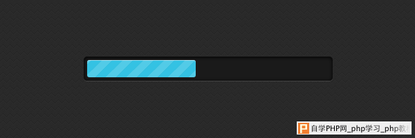
时尚的CSS3进度条先看效果图,非常漂亮吧: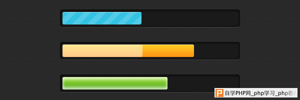
demo:http://demo.jb51.net/js/2012/css3-progress-bars/
英文原文:http://www.red-team-design.com/stylish-css3-progress-bars
HTML代码:
HTML代码比较简单
复制代码
代码如下:<div class="progress-bar blue stripes">
<span style="width: 40%"></span>
</div>
1.progress-bar – 定义进度栏的常规样式。
2.blue – 定义进度条的风格,这里是蓝色的
3.stripes – 当前进度的动画类型。
4 span – 填充进度条。内联设置的宽度,0%-100%,进度条的宽度。
CCS代码:
复制代码
代码如下:.progress-bar {
background-color: #1a1a1a;
height: 25px;
padding: 5px;
width: 350px;
margin: 50px 0;
-moz-border-radius: 5px;
-webkit-border-radius: 5px;
border-radius: 5px;
-moz-box-shadow: 0 1px 5px #000 inset, 0 1px 0 #444;
-webkit-box-shadow: 0 1px 5px #000 inset, 0 1px 0 #444;
box-shadow: 0 1px 5px #000 inset, 0 1px 0 #444;
}
.progress-bar span {
display: inline-block;
height: 25px;
width: 200px;
-moz-border-radius: 3px;
-webkit-border-radius: 3px;
border-radius: 3px;
-moz-box-shadow: 0 1px 0 rgba(255, 255, 255, .5) inset;
-webkit-box-shadow: 0 1px 0 rgba(255, 255, 255, .5) inset;
box-shadow: 0 1px 0 rgba(255, 255, 255, .5) inset;
-webkit-transition: width .4s ease-in-out;
-moz-transition: width .4s ease-in-out;
-ms-transition: width .4s ease-in-out;
-o-transition: width .4s ease-in-out;
transition: width .4s ease-in-out;
}
添加颜色,进度条风格:
复制代码
代码如下:.blue span {
background-color: #34c2e3;
}
.orange span {
background-color: #fecf23;
background-image: -webkit-gradient(linear, left top, left bottom, from(#fecf23), to(#fd9215));
background-image: -webkit-linear-gradient(top, #fecf23, #fd9215);
background-image: -moz-linear-gradient(top, #fecf23, #fd9215);
background-image: -ms-linear-gradient(top, #fecf23, #fd9215);
background-image: -o-linear-gradient(top, #fecf23, #fd9215);
background-image: linear-gradient(top, #fecf23, #fd9215);
}
.green span {
background-color: #a5df41;
background-image: -webkit-gradient(linear, left top, left bottom, from(#a5df41), to(#4ca916));
background-image: -webkit-linear-gradient(top, #a5df41, #4ca916);
background-image: -moz-linear-gradient(top, #a5df41, #4ca916);
background-image: -ms-linear-gradient(top, #a5df41, #4ca916);
background-image: -o-linear-gradient(top, #a5df41, #4ca916);
background-image: linear-gradient(top, #a5df41, #4ca916);
}
条纹样式
复制代码
代码如下:.stripes span {
-webkit-background-size: 30px 30px;
-moz-background-size: 30px 30px;
background-size: 30px 30px;
background-image: -webkit-gradient(linear, left top, right bottom,
color-stop(.25, rgba(255, 255, 255, .15)), color-stop(.25, transparent),
color-stop(.5, transparent), color-stop(.5, rgba(255, 255, 255, .15)),
color-stop(.75, rgba(255, 255, 255, .15)), color-stop(.75, transparent),
to(transparent));
background-image: -webkit-linear-gradient(135deg, rgba(255, 255, 255, .15) 25%, transparent 25%,
transparent 50%, rgba(255, 255, 255, .15) 50%, rgba(255, 255, 255, .15) 75%,
transparent 75%, transparent);
background-image: -moz-linear-gradient(135deg, rgba(255, 255, 255, .15) 25%, transparent 25%,
transparent 50%, rgba(255, 255, 255, .15) 50%, rgba(255, 255, 255, .15) 75%,
transparent 75%, transparent);
background-image: -ms-linear-gradient(135deg, rgba(255, 255, 255, .15) 25%, transparent 25%,
transparent 50%, rgba(255, 255, 255, .15) 50%, rgba(255, 255, 255, .15) 75%,
transparent 75%, transparent);
background-image: -o-linear-gradient(135deg, rgba(255, 255, 255, .15) 25%, transparent 25%,
transparent 50%, rgba(255, 255, 255, .15) 50%, rgba(255, 255, 255, .15) 75%,
transparent 75%, transparent);
background-image: linear-gradient(135deg, rgba(255, 255, 255, .15) 25%, transparent 25%,
transparent 50%, rgba(255, 255, 255, .15) 50%, rgba(255, 255, 255, .15) 75%,
transparent 75%, transparent);
-webkit-animation: animate-stripes 3s linear infinite;
-moz-animation: animate-stripes 3s linear infinite;
}
@-webkit-keyframes animate-stripes {
0% {background-position: 0 0;} 100% {background-position: 60px 0;}
}
@-moz-keyframes animate-stripes {
0% {background-position: 0 0;} 100% {background-position: 60px 0;}
}
闪烁样式:
复制代码
代码如下:.shine span {
position: relative;
}
.shine span::after {
content: '';
opacity: 0;
position: absolute;
top: 0;
right: 0;
bottom: 0;
left: 0;
background: #fff;
-moz-border-radius: 3px;
-webkit-border-radius: 3px;
border-radius: 3px;
-webkit-animation: animate-shine 2s ease-out infinite;
-moz-animation: animate-shine 2s ease-out infinite;
}
@-webkit-keyframes animate-shine {
0% {opacity: 0; width: 0;}
50% {opacity: .5;}
100% {opacity: 0; width: 95%;}
}
@-moz-keyframes animate-shine {
0% {opacity: 0; width: 0;}
50% {opacity: .5;}
100% {opacity: 0; width: 95%;}
}

发光样式:
复制代码
代码如下:.glow span {
-moz-box-shadow: 0 5px 5px rgba(255, 255, 255, .7) inset, 0 -5px 5px rgba(255, 255, 255, .7) inset;
-webkit-box-shadow: 0 5px 5px rgba(255, 255, 255, .7) inset, 0 -5px 5px rgba(255, 255, 255, .7) inset;
box-shadow: 0 5px 5px rgba(255, 255, 255, .7) inset, 0 -5px 5px rgba(255, 255, 255, .7) inset;
-webkit-animation: animate-glow 1s ease-out infinite;
-moz-animation: animate-glow 1s ease-out infinite;
}
@-webkit-keyframes animate-glow {
0% { -webkit-box-shadow: 0 5px 5px rgba(255, 255, 255, .7) inset, 0 -5px 5px rgba(255, 255, 255, .7) inset;}
50% { -webkit-box-shadow: 0 5px 5px rgba(255, 255, 255, .3) inset, 0 -5px 5px rgba(255, 255, 255, .3) inset;}
100% { -webkit-box-shadow: 0 5px 5px rgba(255, 255, 255, .7) inset, 0 -5px 5px rgba(255, 255, 255, .7) inset;}
}
@-moz-keyframes animate-glow {
0% { -moz-box-shadow: 0 5px 5px rgba(255, 255, 255, .7) inset, 0 -5px 5px rgba(255, 255, 255, .7) inset;}
50% { -moz-box-shadow: 0 5px 5px rgba(255, 255, 255, .3) inset, 0 -5px 5px rgba(255, 255, 255, .3) inset;}
100% { -moz-box-shadow: 0 5px 5px rgba(255, 255, 255, .7) inset, 0 -5px 5px rgba(255, 255, 255, .7) inset;}
}
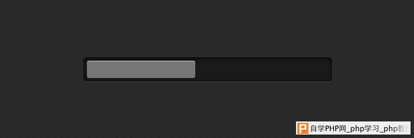
在不支持css3的浏览器下的表现: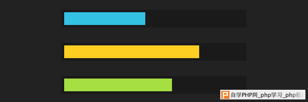
demo:http://demo.jb51.net/js/2012/css3-progress-bars/